
|

|
Forum Index : Microcontroller and PC projects : Colour Maximite Logo
| Author | Message | ||||
MicroBlocks Guru Joined: 12/05/2012 Location: ThailandPosts: 2209 |
Nick, Only number 2 and 4 are possible in a black & white version. 2 is better because it has a fatter border. In number 2 i would try to leave out the yellow color, leaving only Red Green and Blue. Those can be dithered and still look reasonable in B&W. The mixed colors yellow, magenta and cyan would create similar dithering making it harder to distinguish the separate 'lines' in the rainbow. I think a small touch of color is better (classier) than going full blown color. The last logo's are not 8 colors but thousands of colors. When you zoom in you can see that clearly. Those thousands of colors will make the edges look very smooth. This will certainly not be the case in 8 colors or B&W! The result will not look as you think it will. It is one of the reasons why some space between the color parts and the letters look better. Color in between the letters will exaggerate the jagged lines, my suggestion is to leave the space in between the letters black. 
When designing a logo for a system with 8 colors you can better start with pure black and white, especially true for the fonts which will be very jagged and will need a manual touchup. after that switch to color and fill in with solid colors making sure the auto smoothing is disabled or that you work in a 8 color colorspace. Microblocks. Build with logic. |
||||
| vasi Guru Joined: 23/03/2007 Location: RomaniaPosts: 1697 |
2 and 4. TZAdvantage have a point and I know that Nick knows that too. It can be seen better when you design an Windows icon, or a sprite in a game. Anyway, Geoff will need the exact matrix of pixels at the moment of implementation. Or the Basic program for that (which is not ready  ) logo. ) logo.Hobbit name: Togo Toadfoot of Frogmorton Elvish name: Mablung Miriel Beyound Arduino Lang |
||||
MicroBlocks Guru Joined: 12/05/2012 Location: ThailandPosts: 2209 |
Saving it to a jpg or gif (only formats the forum accepts) can cause those extra colors. I think only gif would be able to use only 8 colors and most importantly be lossless, but that depends on which program you use. Microblocks. Build with logic. |
||||
CircuitGizmos Guru Joined: 08/09/2011 Location: United StatesPosts: 1427 |
How about instead of a logo that is a bitmap of several K of data, a logo that is drawn by commands that the language provides? That would mean less flash space used up just for the bitmap of a logo (made on a PC) and instead only a few dozen data bytes? Micromites and Maximites! - Beginning Maximite |
||||
| vasi Guru Joined: 23/03/2007 Location: RomaniaPosts: 1697 |
And with Geoff signature appearing as it is written exactly at boot time 
Here, a better sketch in MyPaint: Platypus or Australia Map: 
Hobbit name: Togo Toadfoot of Frogmorton Elvish name: Mablung Miriel Beyound Arduino Lang |
||||
| Nick Guru Joined: 09/06/2011 Location: AustraliaPosts: 512 |
TZAdvantage: All logos are edited as 8 color BMP. I only convert a copy to JPG for upload to this forum, hense the extra colours you are seeing. This forum doesn't accept BMP format. I'll switch to GIF for the next lot so you can see it in it's true glory. 
There won't be a B/W version of this logo. It's for use in the upcoming Color MMBasic only. The size of the logo with be dependant on what Geoff wants and can use. I'm not worrying about the size at this point. Vasi: I like those hand drawn logos you made. Maybe we should go with one of those? 
I think I've covered the emphasis of colour in all these logos. I'd like to also emphasise "electronics" to cater for the main microcontroller and experimental nature of Maximite. I'll put my thinking cap on... Nick |
||||
MicroBlocks Guru Joined: 12/05/2012 Location: ThailandPosts: 2209 |
Maximite in led's, or maybe drawn with lines like a logic analyzer visualizes logic levels. Some ACII art, that would be cool and very retro :) _ /.\ Y \ / "L // "/ MaxiMite__|/ /\__ Colour / / / / \/ That is just not good enough. :) Microblocks. Build with logic. |
||||
bigmik Guru Joined: 20/06/2011 Location: AustraliaPosts: 2980 |
Of course we have different Fonts as well... so a neat ASCII art with sexy font sizes could be just as impressive and all easilly generated via standard basic commands Mick Mick's uMite Stuff can be found >>> HERE (Kindly hosted by Dontronics) <<< |
||||
| Nick Guru Joined: 09/06/2011 Location: AustraliaPosts: 512 |
This is my latest collection of possible startup logos for the Maximite. The small graphic of the Pic32 after Logo#6 can be placed on any of the logos but I'm thinking that maybe be should just keep it simple and leave out the extra graphic. My personal favourite is #5. It's very clear and highlights colour. 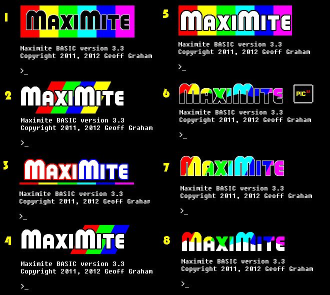
|
||||
CircuitGizmos Guru Joined: 08/09/2011 Location: United StatesPosts: 1427 |
I would laugh if the Color MaxiMite showed the SMPTE pattern for a brief bit on power up.  Micromites and Maximites! - Beginning Maximite |
||||
| vasi Guru Joined: 23/03/2007 Location: RomaniaPosts: 1697 |
I like very much nr.3 But I don't mind if 5 is picked up. Hobbit name: Togo Toadfoot of Frogmorton Elvish name: Mablung Miriel Beyound Arduino Lang |
||||
| vk4tec Senior Member Joined: 24/03/2012 Location: AustraliaPosts: 239 |
I have been watching this thread with interest I am quiety concerned. Whilst it looks interesting, There will be no impact to the hardware ? Will it detract from the performance ? - Andrew - Andrew Rich VK4TEC www.tech-software.net |
||||
| vasi Guru Joined: 23/03/2007 Location: RomaniaPosts: 1697 |
It will reduce the available memory but new PIC32, with a lot of memory, are expected to arrive. This next step is required - IMHO. Even if many will still use (and make their own) first version. Hobbit name: Togo Toadfoot of Frogmorton Elvish name: Mablung Miriel Beyound Arduino Lang |
||||
| Nick Guru Joined: 09/06/2011 Location: AustraliaPosts: 512 |
Displaying a logo on boot? None whatsoever. Just pretties things up a bit and gives the Maximite a bit of "cool" status to stand out from the ever growing crowd. 
Unless you're talking about adding colour to the Maximite. This is happening anyway in Geoff's Maximite 2. You can always stick with the Maximite 1 or the Mini-Maximite if screen display is not required for you're area of need. |
||||
| Nick Guru Joined: 09/06/2011 Location: AustraliaPosts: 512 |
Vasi: Looking at the selection of logos again, I have to agree with you Vasi. Number 3 convey's everything just fine without it being "too out there". And yes, I also agree with what you said... that colour is required. Apart from the better games, colour is also good for conveying information better for any real-world applications. Nearly all the microcontroller/computer boards coming out now have or support colour, either built-in or as a plug in module. Nick |
||||
| Geoffg Guru Joined: 06/06/2011 Location: AustraliaPosts: 3358 |
Nick is right, there will always be the monochrome Maximite and I plan to keep updating MMBasic for that to match Colour MMBasic (except for the colour of course). With the colour version there is a speed hit when printing to the video screen as there is three times the data to write for each pixel. Preliminary tests show that writing a colour character to the screen takes about 180uS vs 122uS on the monochrome Maximite, so it is not as bad as you would think. I am also planning an eight colour 240x216 pixel mode on the Colour Maximite which is very fast and uses little memory - hopefully good for games. Geoff Geoff Graham - http://geoffg.net |
||||
MicroBlocks Guru Joined: 12/05/2012 Location: ThailandPosts: 2209 |
Geoff, can i suggest for the lower resolution mode to pick 400x240 or 240 x 144 or any other resolution that has a 5:3 ratio. (That is a ratio in pixels. not the same as the ratio it is displayed, that would be 16:9 meaning the pixels are not completely square) This because many smaller widescreens that are available will scale this very well. A small 7" screen combined with a small maximite can be used very good in a car or boat opening up a wide range of possible uses and possibly boost sales, i am speaking out of self interest here too. :) The biggest 'problem' with non standard ratios is that it looks quit bad on a LCD/TFT screen as some pixels will be double and others tripled. My feeling is that the first Maximite resolution was influenced by the composite video out, but now going only to VGA i think going to standard ratios would be a good thing. Sorry for my continued tries to makes this possible, i really think it is that important. But if it can't be done, thats oke too. :) Microblocks. Build with logic. |
||||
| Gizmo Admin Group Joined: 05/06/2004 Location: AustraliaPosts: 5177 |
Dont forget if using the composit output we only have black and white. We have to be carefull the logo looks readable in 2 colours. 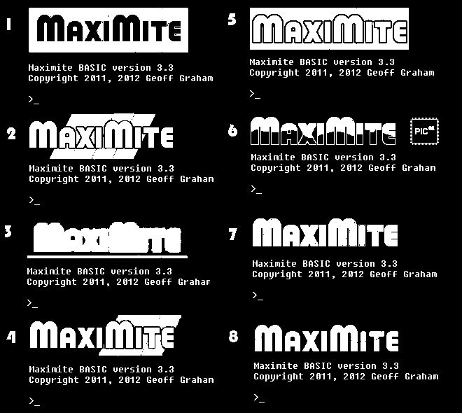
Glenn The best time to plant a tree was twenty years ago, the second best time is right now. JAQ |
||||
| vasi Guru Joined: 23/03/2007 Location: RomaniaPosts: 1697 |
Maybe the color logo will not be included in next versions of MMBasic for Maximite 1. It will have a proper black&white one, so no worry, we can keep 3. for the color version  . .Hobbit name: Togo Toadfoot of Frogmorton Elvish name: Mablung Miriel Beyound Arduino Lang |
||||
| Nick Guru Joined: 09/06/2011 Location: AustraliaPosts: 512 |
I though Geoff said there would be no composite out on the Maximite 2, only VGA colour. The color logo would not appear on the MMBASIC version for the older Maximites. Geoff can confirm. Nick |
||||
| The Back Shed's forum code is written, and hosted, in Australia. | © JAQ Software 2026 |