
|

|
Forum Index : Microcontroller and PC projects : Colour Maximite Logo
| Author | Message | ||||
| Nick Guru Joined: 09/06/2011 Location: AustraliaPosts: 512 |
I like the cockatoo! What about the Lorakeet? (spelling?) It's colourful and I haven't seen it being used in other Aussie logos. Are Lorakeets native to Australia only though? |
||||
| djuqa Guru Joined: 23/11/2011 Location: AustraliaPosts: 447 |
Why not have a file called "autologo.bmp" the like the autoloading basic program file will load at boot time. That way people can use their own logo as the startup VK4MU MicroController Units |
||||
| Nick Guru Joined: 09/06/2011 Location: AustraliaPosts: 512 |
That true but it doesn't give the Maximite an identity. The Mac, when it fires up you see the Apple logo. That sets its identity. Whenever you see that Apple logo, you immediately associate it with Apple. A logo that appears on a few users systems, that is different on each one sets up nothing. If every Maximite booted with the official logo it becomes a brand. Remember the Bee on the Microbee logo? Even the Apple II startup "beep" is distinct (I can pick that beep blindfolded). Without an official logo, the Maximite is just another controller board. I'm such a techno-sentimentalist. 
|
||||
| vasi Guru Joined: 23/03/2007 Location: RomaniaPosts: 1697 |
Nick, I like number 1 and 4. The cyan color of the text Maximite just don't go well with colored bands. Hobbit name: Togo Toadfoot of Frogmorton Elvish name: Mablung Miriel Beyound Arduino Lang |
||||
| djuqa Guru Joined: 23/11/2011 Location: AustraliaPosts: 447 |
well a default.bmp which is the maximite logo which can be replaced with the autorun if needed VK4MU MicroController Units |
||||
| Nick Guru Joined: 09/06/2011 Location: AustraliaPosts: 512 |
I agree vasi, 1 and 4 are the better ones. Well, I think white text it is. Now to pick the best rainbow design. Anyone with better ideas, just chime in. |
||||
MicroBlocks Guru Joined: 12/05/2012 Location: ThailandPosts: 2209 |
Nick, Could you make a variation of number 2 where the rainbow is only above the word MaxiMite with a small balck space between the color and the word , make the colorbar not stick out but keep it within the width of the word leaving about 5-10 pixels on each side and the word MaxiMite not in italic. If i look at your logo it has a lot of colors that are used to make it visual better, converting it to 8 color will make it have very jagged edges. Microblocks. Build with logic. |
||||
| Nick Guru Joined: 09/06/2011 Location: AustraliaPosts: 512 |
TZAdvantage: Similar to the sample you sent in on the previous page but make the color bar spread the length of the text? Also make the text white? I'll give it a try tonight when I get home. I forgot to ask everyone... do we prefer the italic text or normal? Nick |
||||
MicroBlocks Guru Joined: 12/05/2012 Location: ThailandPosts: 2209 |
Nick: To both of your questions, yes. :) I think the italic will be jagged, for a good preview save your design as an 8 or 16 color bitmap. Microblocks. Build with logic. |
||||
| Geoffg Guru Joined: 06/06/2011 Location: AustraliaPosts: 3358 |
I liked the normal. Geoff Geoff Graham - http://geoffg.net |
||||
| vasi Guru Joined: 23/03/2007 Location: RomaniaPosts: 1697 |
Nick, what about something like this (or variations on this): 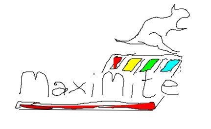
That is supposed to be a kangaroo... I know the logo is not well dimensioned but maybe is a start for something good. Is just a fast draw (is not a new font  ) in Inkscape. Don't have Gimp installed so I wasn't able to work on your logo. ) in Inkscape. Don't have Gimp installed so I wasn't able to work on your logo.Hobbit name: Togo Toadfoot of Frogmorton Elvish name: Mablung Miriel Beyound Arduino Lang |
||||
donmck Guru Joined: 09/06/2011 Location: AustraliaPosts: 1314 |
I think that is a West Australian Quokka: 
http://en.wikipedia.org/wiki/Quokka But yes, I get the idea Vasi. Anyone world wide would know the Kangaroo. Well, I hope they would. Don... https://www.dontronics.com |
||||
| vasi Guru Joined: 23/03/2007 Location: RomaniaPosts: 1697 |
This was the intended shape 
Don, I didn't knew about that animal, thanks. Hobbit name: Togo Toadfoot of Frogmorton Elvish name: Mablung Miriel Beyound Arduino Lang |
||||
| vasi Guru Joined: 23/03/2007 Location: RomaniaPosts: 1697 |
Or maybe this pose. A funny Kangaroo resting on the logo (I think is a little scary - nobody wants to mess with him). 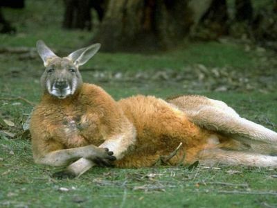
Hobbit name: Togo Toadfoot of Frogmorton Elvish name: Mablung Miriel Beyound Arduino Lang |
||||
bigmik Guru Joined: 20/06/2011 Location: AustraliaPosts: 2980 |
I will Nod my head in agreement too.. 1 and 4 for me Cyan is a bit bland .... white text is great... The only comment is that the Maximite text seems to stand out more on option 1 than op. 4 I think it has a better black border around the text which I like how does the italic look with a wider black border outlining the letters Regards, Mick Mick's uMite Stuff can be found >>> HERE (Kindly hosted by Dontronics) <<< |
||||
| vasi Guru Joined: 23/03/2007 Location: RomaniaPosts: 1697 |
As for rainbow, keep only 4 bands as in design nr.1 but with color order as in nr.4 (ZX Spectrum) Hobbit name: Togo Toadfoot of Frogmorton Elvish name: Mablung Miriel Beyound Arduino Lang |
||||
| Nick Guru Joined: 09/06/2011 Location: AustraliaPosts: 512 |
Here's some more. All 8 colour. 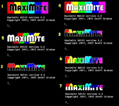
|
||||
| BobDevries Senior Member Joined: 08/06/2011 Location: AustraliaPosts: 266 |
Hi Nick, I vote for number 1 in your latest offerings. Regards, Bob Devries Dalby, QLD, Australia |
||||
| cosmic frog Guru Joined: 09/02/2012 Location: United KingdomPosts: 307 |
No.2 for me |
||||
| paceman Guru Joined: 07/10/2011 Location: AustraliaPosts: 1329 |
Seven for me I think - its clean and bright. I'm not sure it tells the colour story that well though. Greg |
||||
| The Back Shed's forum code is written, and hosted, in Australia. | © JAQ Software 2026 |