|

|
Forum Index : Microcontroller and PC projects : Colour Maximite Logo
| Author | Message | ||||
| Nick Guru Joined: 09/06/2011 Location: AustraliaPosts: 512 |
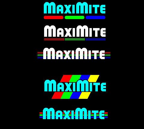
Bruce: Yes, I could enlarge the bar. I'll see what a few more people say. I'm trying to create the logo with the restrictions of no animation and max of 8 colours. No animation because such a logo cannot be animated if it were to appear on a printed page. And 8 colours in case Geoff cannot implement 16 (or more) colours. I want a logo that can be displayed both in print and on the Maximite screen. Logos 3 to 4 look colourful but I am in conflict about it looking too colourful or "jazzed" up so it doesn't cast an impression of the Maximite as a "toy" or "gimmicky" system. Logos 1 and 2 are my favourites, they cast a bit more of a professional stance on the Maximite while still portraying it as a colour system. It's all very subjective, hense the requirement for feedback from everyone so we can find a logo with the widest appeal. |
||||
| Nick Guru Joined: 09/06/2011 Location: AustraliaPosts: 512 |
Sorry guys, Logo 3 just didn't do it for me so I replaced it with another. 
|
||||
| vasi Guru Joined: 23/03/2007 Location: RomaniaPosts: 1697 |
Nr.4 works better having text Maximite painted with white. Nr.1 the same. Hobbit name: Togo Toadfoot of Frogmorton Elvish name: Mablung Miriel Beyound Arduino Lang |
||||
| Gizmo Admin Group Joined: 05/06/2004 Location: AustraliaPosts: 5177 |
I wonder if it should include something to show where it came from, Australia. Like a little simplified Australia outline, or a native animal. The best time to plant a tree was twenty years ago, the second best time is right now. JAQ |
||||
| BobD Guru Joined: 07/12/2011 Location: AustraliaPosts: 935 |
Gizmo, me being a bit of a cynic reckons that a lot of Aussies would not even recognise a map of Australia and certainly not a native animal but I like your idea though. +1 Bob |
||||
| Nick Guru Joined: 09/06/2011 Location: AustraliaPosts: 512 |
I like the ideas coming in. I agree, white looks more professional than the cyan. Will update later tonight. I like the scanline look to the RGB bars. Gives a bit of a retro tech look but I am concerned how they'll come out on an upscaling LCD. An Aussie icon logo is good. Maybe an Aussie mascot or something symbolic? An aussie map of Australia is too obvious and has been done before. Is there something else that is distinctly Aussie? Something that is easily recognisable as Australian to a global marketplace? (No! not a cane toad!) 
Nick |
||||
| djuqa Guru Joined: 23/11/2011 Location: AustraliaPosts: 447 |
kangaroo <<although as with MY logo it will be totally ignored by everyone. VK4MU MicroController Units |
||||
bigmik Guru Joined: 20/06/2011 Location: AustraliaPosts: 2980 |
What about WHITE text and a little Map of Aus with the states in different colours? Mick Mick's uMite Stuff can be found >>> HERE (Kindly hosted by Dontronics) <<< |
||||
| shoebuckle Senior Member Joined: 21/01/2012 Location: AustraliaPosts: 189 |
I still prefer No 5 but with MaxiMite text in white with a 1-2px black boarder. I really like the 3 bars behind the text and I think they are perfect width. Cheers, Hugh |
||||
| Geoffg Guru Joined: 06/06/2011 Location: AustraliaPosts: 3358 |
This debate is excellent. Just one point Nick, we cannot have an intensity control because that would require another SPI channel for pixel by pixel control and there are none free, even on the 100 pin chip. Were you thinking of one large logo that appeared on startup and then disappeared after a few seconds to be replaced by the command prompt? Like a splash screen? Geoff Geoff Graham - http://geoffg.net |
||||
MicroBlocks Guru Joined: 12/05/2012 Location: ThailandPosts: 2209 |
I would not like a splash screen. It is just waisted time. I would put it on the current startup screen on the top and let it scroll off the screen when commands are entered or of course when a cls is done. Microblocks. Build with logic. |
||||
| Nick Guru Joined: 09/06/2011 Location: AustraliaPosts: 512 |
Geoff: No. I was thinking a small logo, as per the screenshots above. The logo would appear centred on the screen for 2-3 seconds (maybe with a tune, ala Windows or MacOS) then disappear and MMBasic boot up as normal with the usual credits. I thought this wouldn't be too much to add in. It's more to give the Maximite a symbolic identity... like a "brand". If we have scope for more, we could look at a splash screen but a colour image stored in the firmware may take up too much space, I would have thought. Shame about the 16 colours but 8 will suffice. |
||||
MicroBlocks Guru Joined: 12/05/2012 Location: ThailandPosts: 2209 |
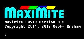
I could not edit my previous post but this is what i would do. With a slightly edited version of the logo i like. 
The startup is instant, and it probably stays in view longer than a splash screen thus having more viewtime and impact. The logo also would be nice to act as a screensaver. :) Another wish is that a white background with black text should be possible or any other combination for that matter (flash configuration setting?) Microblocks. Build with logic. |
||||
| Geoffg Guru Joined: 06/06/2011 Location: AustraliaPosts: 3358 |
Yes, that is in Colour MMBasic (any colour text on any colour background). Geoff Geoff Graham - http://geoffg.net |
||||
| Gizmo Admin Group Joined: 05/06/2004 Location: AustraliaPosts: 5177 |
Big NO to the tune idea, sorry Nick. The sound output could be used for other purposes, as a PWM output for example. We dont want unexpected outputs signals independant of the users program. If the user is using the sound output to drive a external device, then a reboot and a welcome tune could have bad consequences. Glenn The best time to plant a tree was twenty years ago, the second best time is right now. JAQ |
||||
| Gizmo Admin Group Joined: 05/06/2004 Location: AustraliaPosts: 5177 |
I like TZAdvantage's thinking and layout. Glenn The best time to plant a tree was twenty years ago, the second best time is right now. JAQ |
||||
| vasi Guru Joined: 23/03/2007 Location: RomaniaPosts: 1697 |
Five stars to TZAdvantage. Of course there is Nick's work but I like the idea and the logo. [quote=BobD]...a lot of Aussies would not even recognise a map of Australia...[/quote] Bob, that would not be for Aussies  . .Hobbit name: Togo Toadfoot of Frogmorton Elvish name: Mablung Miriel Beyound Arduino Lang |
||||
| JohnS Guru Joined: 18/11/2011 Location: United KingdomPosts: 4304 |
A hat with dangling corks? John |
||||
| Nick Guru Joined: 09/06/2011 Location: AustraliaPosts: 512 |
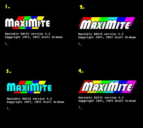
The concept is evolving. TZAdvantage is right. Do away with the logo just in the centre along with it's delay. Just throw it instantly on the screen with the MMBASIC copyright notices below it and have it ready to go instantly. One of the Maximite's big features is the "instant on" so why take that away? Here is my latest drafts... 
|
||||
James_From_Canb Senior Member Joined: 19/06/2011 Location: AustraliaPosts: 265 |
A cockatoo? Only two colours, versatile, learns quickly and speaks our language. And I like number 1, but I also like TZAdvantage's one too. James My mind is aglow with whirling, transient nodes of thought careening through a cosmic vapor of invention. Hedley Lamarr, Blazing Saddles (1974) |
||||
| The Back Shed's forum code is written, and hosted, in Australia. | © JAQ Software 2026 |