
|

|
Forum Index : Microcontroller and PC projects : Colour Maximite Logo
| Page 1 of 6 |
|||||
| Author | Message | ||||
| Nick Guru Joined: 09/06/2011 Location: AustraliaPosts: 512 |
Here's my first attempt at a Colour Maximite Logo. The idea is to have it boot with this on powerup. This would be followed by the normal Copyright and Version number notices before dropping into the command prompt cursor. They are within the 8 colour mod spec. (these are only 5 colours) Which one of these 3 do people find more appealing? Anyone with a better idea? 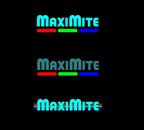
|
||||
| cosmic frog Guru Joined: 09/02/2012 Location: United KingdomPosts: 307 |
Me and my wife are liking the third one best. Great job on all of them though. Dave. |
||||
| vasi Guru Joined: 23/03/2007 Location: RomaniaPosts: 1697 |
The middle one. But I would like to see also other sketches... Hobbit name: Togo Toadfoot of Frogmorton Elvish name: Mablung Miriel Beyound Arduino Lang |
||||
donmck Guru Joined: 09/06/2011 Location: AustraliaPosts: 1314 |
Three Don... https://www.dontronics.com |
||||
| BobD Guru Joined: 07/12/2011 Location: AustraliaPosts: 935 |
two |
||||
| Geoffg Guru Joined: 06/06/2011 Location: AustraliaPosts: 3358 |
Great job. For me it is number one. The reason that I like it is that it has a solid simplicity. Also it would be easier to print on the front panel of the box and it would make an excellent logo for the magazine article, web pages, etc. This will be a hard choice. Geoff Geoff Graham - http://geoffg.net |
||||
James_From_Canb Senior Member Joined: 19/06/2011 Location: AustraliaPosts: 265 |
Third, because it makes the text stand out. It looks significantly brighter than the first. James My mind is aglow with whirling, transient nodes of thought careening through a cosmic vapor of invention. Hedley Lamarr, Blazing Saddles (1974) |
||||
| Gizmo Admin Group Joined: 05/06/2004 Location: AustraliaPosts: 5177 |
Need to take into account how it would look on different backgrounds. On a white/cream background, would there be a black border? Glenn The best time to plant a tree was twenty years ago, the second best time is right now. JAQ |
||||
| Nick Guru Joined: 09/06/2011 Location: AustraliaPosts: 512 |
Wide spread of opinions! I think number 2 may be out because of the whole LCD versus CRT issue. On a CRT it will look great. On an LCD, I'm afraid the LCD upscaler will distort the image and ruin the "scanline" look of the text. Some scanlines will join together , destoying the consitency of the effect. I'm hinging on #1 for simplicity and clarity although #3 is not far behind. Nick |
||||
| djuqa Guru Joined: 23/11/2011 Location: AustraliaPosts: 447 |
My suggestion 
VK4MU MicroController Units |
||||
bigmik Guru Joined: 20/06/2011 Location: AustraliaPosts: 2980 |
Hi Nick, I prefer No. 2 from the options, (dont like No3 at all) but I really don't think any of them quite hit the Mark (sorry Nick), not a complaint just constructive Criticism I feel we can do something a bit more Jazzy.. I am not good at computer art but I am sure others are.. What are the size (pixel wise) we are looking at for a logo. Regards, Mick Mick's uMite Stuff can be found >>> HERE (Kindly hosted by Dontronics) <<< |
||||
bigmik Guru Joined: 20/06/2011 Location: AustraliaPosts: 2980 |
Lads/Lassies, I am not really good at graphic design and I am not sure what this would look like in this forum but it is an animated gif but the color changes can be done by the Pic 32 fairly easilly (I think). If the colors dont change then save the image file and open in Internet explore to see the effect Regards, Mick EDIT ** The Back Shed strips off the animation, download this zip file and then open the logo with iE to view it. Mick 2012-05-28_035522_MM_Logo.zip Mick's uMite Stuff can be found >>> HERE (Kindly hosted by Dontronics) <<< |
||||
| Nick Guru Joined: 09/06/2011 Location: AustraliaPosts: 512 |
Looks good bigmik. I don't know if Geoff wants to add much more code than just to display the logo, but if he does, this looks good. And if Geoff can add intesity control to give us 16 colours, we can go nuts with something even more colourful. Nick |
||||
| Gizmo Admin Group Joined: 05/06/2004 Location: AustraliaPosts: 5177 |
Yeah sorry Mick the image processing of the forum would probably kill the frames in a animated gif. Another thing to consider with these colour logo's is how they will look in black and white, like when using composite video. Glenn The best time to plant a tree was twenty years ago, the second best time is right now. JAQ |
||||
| Nick Guru Joined: 09/06/2011 Location: AustraliaPosts: 512 |
Regarding composite video... The Maximite Version 2 with colour won't have composite, VGA only...according to Geoff. Nick |
||||
brucepython Regular Member Joined: 19/06/2011 Location: AustraliaPosts: 64 |
I like number 1. A single pixel black edge would be worthwhile if the background is not black. The flashing GIF version would not do a lot for my attempts to avoid epileptic seizures. Not a great idea. Bruce |
||||
| vasi Guru Joined: 23/03/2007 Location: RomaniaPosts: 1697 |
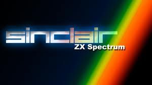
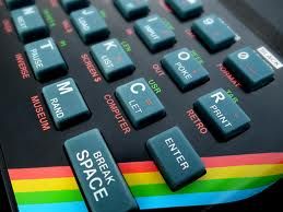
I liked very much ZX-Spectrum logo  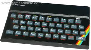
Hobbit name: Togo Toadfoot of Frogmorton Elvish name: Mablung Miriel Beyound Arduino Lang |
||||
| Nick Guru Joined: 09/06/2011 Location: AustraliaPosts: 512 |
Here's another set of designs. Let the voting begin! My favourite here is the second one from the top. 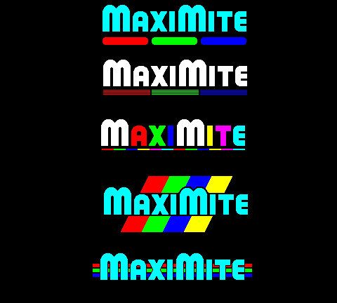
|
||||
brucepython Regular Member Joined: 19/06/2011 Location: AustraliaPosts: 64 |
Number 1 please Nick! Bruce |
||||
bigmik Guru Joined: 20/06/2011 Location: AustraliaPosts: 2980 |
Hi Bruce, I appreciate that... it doesnt have to be flashing it can just do one cycle of colour change of letters... or even a colour change (cycling rainbow) on just the first M... Just trying to jazz it up a little bit.. Nick, I probably prefer No. 3 then No. 4 Can the colour bar under No 3 be twice as thick? Mick Mick's uMite Stuff can be found >>> HERE (Kindly hosted by Dontronics) <<< |
||||
| Page 1 of 6 |
|||||
| The Back Shed's forum code is written, and hosted, in Australia. | © JAQ Software 2026 |